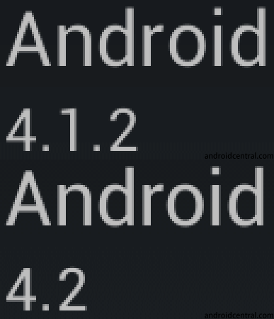
Text looks a bit different in Android 4.2
Author Chinavasion Marketing
15.11.2012. | 17:46
An undocumented change until now in Android 4.2 was a slight change in the way the text is displayed on your screen. Google didn’t make any groundbreaking changes but a very subtle update making the text look slightly bolder with smoother edges and improved kerning (letter spacing). This applies throughout the UI, in emails, web pages and other applications.
Look closer at the GIF and you will notice the changes.
Source: Android Central .
Related
Author Chinavasion Marketing
15.11.2012. | 17:46
Archive Archive
Select Month
March 2024
February 2024
January 2024
December 2023
November 2023
October 2023
September 2023
August 2023
July 2023
June 2023
May 2023
April 2023
November 2022
October 2022
September 2022
July 2022
May 2022
March 2022
February 2022
January 2022
December 2021
November 2021
September 2021
August 2021
July 2021
June 2021
May 2021
March 2021
February 2021
January 2021
December 2020
August 2020
July 2020
June 2020
May 2020
April 2020
January 2020
December 2019
November 2019
October 2019
September 2019
August 2019
June 2019
May 2019
April 2019
March 2019
February 2019
January 2019
December 2018
November 2018
October 2018
March 2018
February 2018
January 2018
December 2017
November 2017
October 2017
September 2017
August 2017
July 2017
June 2017
May 2017
April 2017
March 2017
February 2017
January 2017
December 2016
November 2016
October 2016
September 2016
August 2016
July 2016
June 2016
May 2016
April 2016
March 2016
February 2016
January 2016
December 2015
November 2015
October 2015
September 2015
August 2015
July 2015
June 2015
May 2015
April 2015
March 2015
February 2015
January 2015
December 2014
November 2014
October 2014
September 2014
August 2014
July 2014
June 2014
May 2014
April 2014
March 2014
February 2014
January 2014
December 2013
November 2013
October 2013
September 2013
August 2013
July 2013
June 2013
May 2013
April 2013
March 2013
February 2013
January 2013
December 2012
November 2012
October 2012
September 2012
August 2012
July 2012
June 2012
May 2012
April 2012
March 2012
February 2012
January 2012
December 2011
November 2011
October 2011
September 2011
August 2011
July 2011
June 2011
May 2011
April 2011
March 2011
January 2011
December 2010
November 2010
October 2010
September 2010
August 2010
July 2010
June 2010
May 2010
April 2010
March 2010
February 2010
January 2010
December 2009
November 2009
October 2009
September 2009
August 2009
July 2009
June 2009
May 2009
April 2009
March 2009
February 2009
January 2009
December 2008
November 2008
October 2008
September 2008
August 2008
July 2008
June 2008
May 2008
April 2008
March 2008
February 2008
January 2008
December 2007
November 2007
October 2007
September 2007
August 2007
July 2007
June 2007
May 2007
April 2007
March 2007
February 2007
January 2007


Let me tell You a sad story ! There are no comments yet, but You can be first one to comment this article.
Write a comment